My photographer friend was gracious enough to give me a two-hour lesson today on how to take good digital photos and how to edit them in Photoshop. Basically, I wanted to learn how to use my Canon EOS Rebel XS beyond the auto-focus setting and how to use Photoshop beyond the auto-levels setting. Granted, it can’t all be taught in two hours, but the following are the things I picked up on today.
First, it’s crucial to have a tripod. This ensures you get a crisp, in-focus photo.
Next, activate the timer on the camera to two seconds. When you press the shutter button you are probably going to shake the camera slightly, which can produce an out-of-focus shot. Giving your camera a two-second delay ensures that once the shutter button is pressed the camera is nice and still by the time the exposure is taken.
Now, let’s change that dial on your camera from “Auto” to “M.”
The first thing you’ll notice is on the viewing screen there is a light meter. When you push the shutter button down halfway, in addition to automatically focusing the shot it will now tell you if you need more or less light.
This brings us to the basics of photography. There are two main ways to let light into your camera: the shutter speed and the aperture. The shutter speed on my camera can vary from 1/4000th of a second to 30 seconds. Whatever I set it on, that’s how long the shutter will be open and the “film” will be exposed to light.
The aperture is the size of the hole that lets light into the lens. This is measured in F-stops. The larger the F-stop number, the smaller the aperture is and the less light can get into the camera.
So finding the right balance of light means finding a balance of shutter speed and aperture. There are many combinations of the two that can give you the right amount of light for your photo. These different combinations can create different depths of focus.
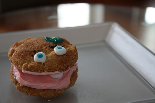
For instance, you could take a photo with a very large aperture, say, F5.6, and a very quick shutter speed such as 1/800 and you might get a photo such as this:
This photo is strictly what the light meter in my camera judged to be the right amount of light. We’ll address this later. What you can initially notice is that the cookie is in focus but pretty much everything else is out of focus, such as the back corner of the plate and the far background.
Now, on the opposite end of the spectrum, if you have a very small aperture such as F22 and a slow shutter speed such as 1/25, your photo could look something like this:
You might notice that now the plate is more in focus and so is the background. The small aperture has created a greater depth of focus. Incidentally, I also added a black piece of tagboard in the background to take away the bright white spots. That’s why it looks really different in the background.
You can notice how the second photo looks brighter than the first. That’s because I fiddled with the
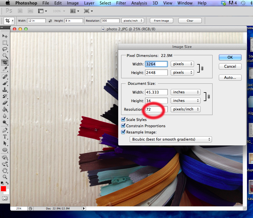
histogram. When you view your photo on your camera, there’s a way to look either at the whole photo or a tiny version of the photo with a little graph next to it. You want to be able to view the tiny graph. The histogram has divided your photo up into 255 shades of grey from the blackest of black to the whitest of white. The graph shows blacks on the left and whites on the right. The vertical axis displays how many pixels in that photo are in that specific area of dark to light. When my camera automatically set the light meter, it didn’t take the whitest of whites into consideration. I altered the shutter speed so the light meter appeared to be slightly overexposed.
You want to shift everything a little more to the right in the histogram, creating more pure whites in the photo. The reasoning behind this, which isn’t totally clear to me, is that digital photos store most of their data in the white parts so it’s best to contain as much info in the whites cause you can alter it later in photoshop. It’s better to have too much information than not enough.
After I altered the exposure and viewed the histogram, the little photo started blinking in the whitest areas. That’s good. You want there to be some true white spots, just not too many of them. I haven’t quite learned why, but for now this is my best explanation.
I took several shots of this oyster where I altered the F-stop and shutter speeds so the light was balanced slightly to the right on the little light meter. Each time I took a photo I would check the histogram and see if the photo was blinking little hot spots. If it wasn’t I’d either change the aperture or shutter speed so the light meter would be one setting farther to the right.
Then I loaded up my photos onto my computer. My Photoshop is having trouble processing RAW files, so for now, we’ll just use JPEGs. When I loaded up my photos I looked at the differences of depth of focus. This is where you can be the artist. I decided I liked the plate to be in focus, so I chose the photo above to manipulate in Photoshop.
This is where you can make your photo truly shine. It’s important to know the basics of taking a good photo, such as composition and light direction, but in Photoshop you can bring out the best parts of your photo to make it look amazing.
I really love the photos featured on
Foodgawker.com. They look all bright and cheery. I want to achieve this look with my blog photos. I think a lot of it has to do with how you manipulate the photo in Photoshop.
First, open up the image you want to manipulate. Look at the image at 100 per cent size by double-clicking the magnifying glass. It is important that your photo is sharp to begin with. The first photo I opened was not sharp at 100 per cent, but looked sharp at 16 per cent.
Now, create a duplicate layer (command J). Doing all the manipulation on layers is a good idea in case you screw it all up. If you do you can always delete the layers and still have the original image. The first thing you can do is adjust the brightness and contrast. Looking at the photo above, I determined the image was a little flat and grey. I increased the brightness and contrast levels and the photo already looked more cheerful.
But what if I wanted parts of the photo to be brighter and parts to be darker? One good method is to create a layer mask in the duplicate layer. Then select the paintbrush tool and make the brush size pretty large, like 1100. Make sure the paint color is black and start painting over the bright spots that you want darker, such as the plate. This will keep the cookie nice and bright, but will darken the plate.
What if you want to darken the plate, but not as much as it’s darkening it now? Just double click the black paint swatch and click the center of the color palate. That will make it grey and will make the plate less dark when you paint over it.
Another technique is to select “filter>sharpen>unsharp mask.” Drag the preview to an important part of a image. I used the eye as a reference point. This way you can see up close what the filter is doing. Select the Amount at 20 per cent and drag the radius all the way to the maximum right, 250 pixels. Doing this gave my cookie punch. It just looked better.
One more touch is to select “Filter>sharpen>smart sharpen” and find the most defined part of your photo, in this case, maybe the granules of sugar on top. Fiddle with the amount and radius and see if you like the result.
And yet another technique is to select “Shadows/Highlights” in the Adjustments menu. Select “Show more options” and fiddle with the highlights. Also, raise the midtone contrast.
Lastly, use the rubber stamp tool to remove any blemishes. My cookie had some dirt on it so my rubber stamp got rid of it.
After all these adjustments, here’s what my image looked like.
Yowza! It’s not a huge difference all in all, but just the subtle changes make the photo better. It takes what’s already good in real life and makes it better than it actually looks, I guess.
Here’s a before and after, just to see the difference better:
 |
| before |
 |
| after |
Oh, and thanks to Susie for the adorable oyster cookie. It was delish!